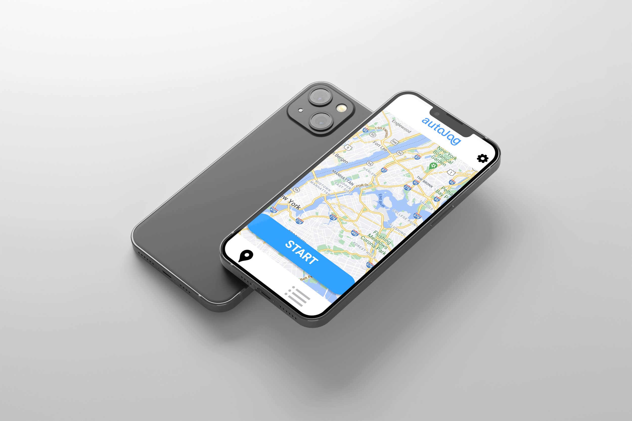
AutoJog
ROLE: UX DESIGNER & RESEARCHER
NOVEMBER 2020
"AutoJog" is a collaborative entrepreneurial project published to the App Store for IOS users. It is an application designed for Ann Arbor residents that automatically generates new and exciting routes for running, walking or biking. I worked with a team of engineers, software and industrial, who helped conduct research, user testing, focus groups and produce the application.
In my role as the Lead UX Designer & Researcher, I led the design process for this application creating the logo, user interface, and overall visual design. After conducting market research, I developed a clean and simple layout—starting with wireframes in Balsamiq, followed by the final visual design in Figma based on user feedback from mockups. The map images shown in the photos are placeholders; in the actual application, a Google Maps image will display the user's current location. If you would like to download and view the MVP application, it can be found on the IOS app store by searching “AutoJog.”
Research
The first step in our process was to ensure the application would be both useful and desirable for our target demographic. We created a short survey and gathered feedback from the Michigan running team, track & field team, running club, local sports stores, and our classmates. With 111 responses, 70.7% of participants said they would definitely download and use the app. The survey also included questions about pricing, which helped guide our decisions on cost, profit, and growth projections later in the process.
After gathering initial feedback, we sent out a second survey to our target demographic, including Michigan running teams, clubs, and local running stores, to learn what features users wanted in the app. One key feature we hadn’t considered was the demand for route elevation based on the user's current location. Other popular suggestions included GPS directions, mileage tracking, the ability to save routes, and projected run times.
I then began developing the low-fidelity prototype of the app's basic pages, incorporating the feedback from the survey (Figure 1). My team reviewed the design, and we made adjustments to create a layout that was clear and easy to navigate. Using Balsamiq, I prototyped the interface, ensuring all features were functional (Figure 2). Next, we conducted one-on-one focus groups, where users tested the design to identify any overlooked issues. From their feedback, we discovered that some buttons were unclear and needed refinement for the final prototype.
The high-fidelity, fully functional prototype was created using Figma. We once again conducted focus groups, which allowed us to identify and refine additional design issues. The app then moved into production, and AutoJog was officially launched. The version currently available on the iOS App Store is an MVP (Minimum Viable Product), meaning not all features were included in the initial release, however is still a fully functioning product.
Figure 1.
Figure 2.


