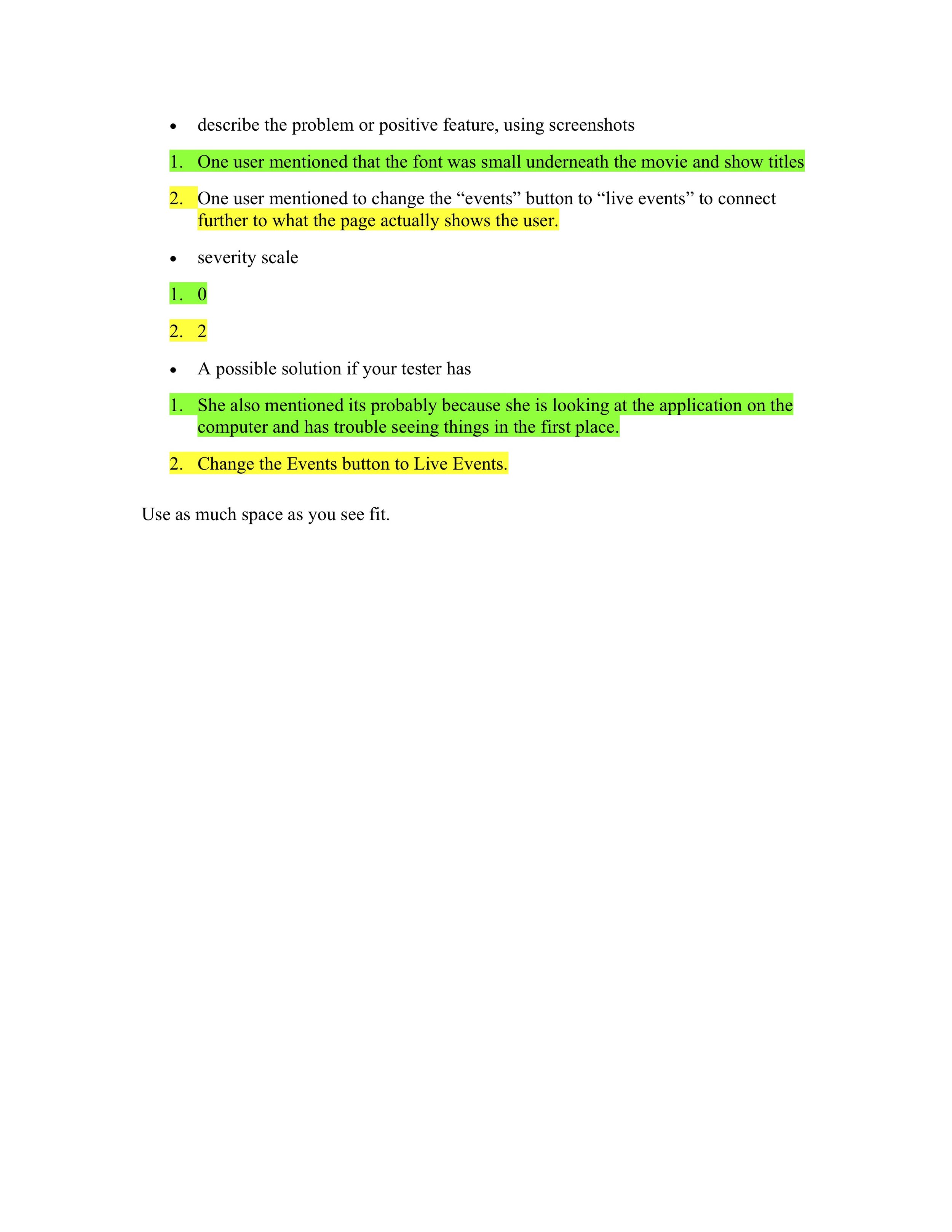
WatchNext
ROLE: UX DESIGNER & RESEARCHER
MARCH 2021
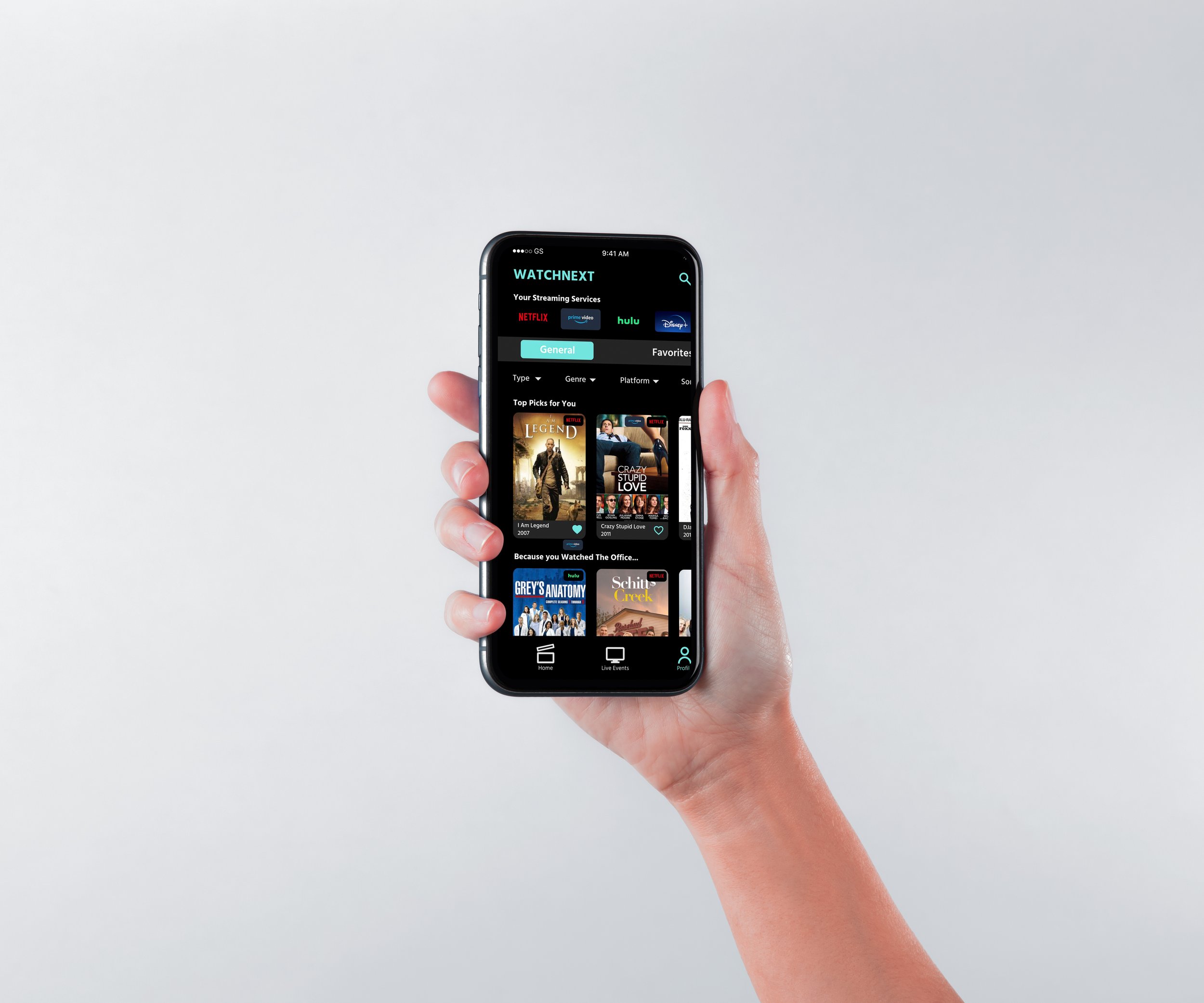
“WatchNext” is a conceptual app designed to streamline browsing across subscription-based streaming platforms, offering a more efficient and personalized experience. The app enables users to easily discover and watch new or upcoming series from multiple streaming platforms in one place, simplifying the process for those stuck in quarantine. It also features a 'Live Events' page, where users can find out where to stream major live events, like the Super Bowl or award shows, on their preferred platforms.
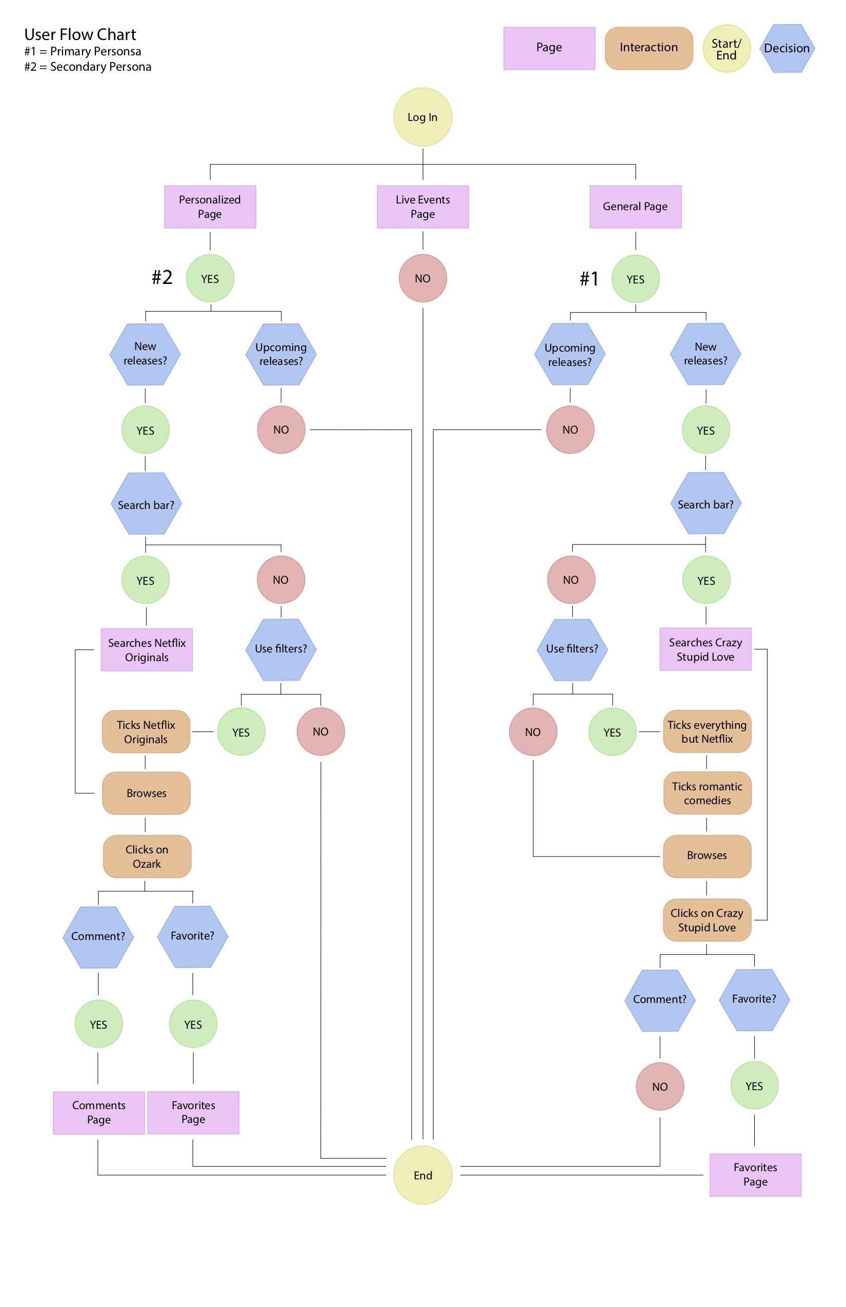
As the lead UX Designer and Researcher, I conducted comprehensive user research to develop primary and secondary personas, along with user flow charts that illustrated the app’s functionality and need. I began by sketching low- and mid-fidelity prototypes using pen and paper, followed by Balsamiq, before finalizing the visual design in Figma. Each stage of the process was informed by thorough user research, as detailed below.
WatchNext - Phone Application
To view the full prototype including all usability features and design, click here
WatchNext - Smart TV Application
To view the full prototype including all usability features and design, click here
WatchNext - Style Guide
Research
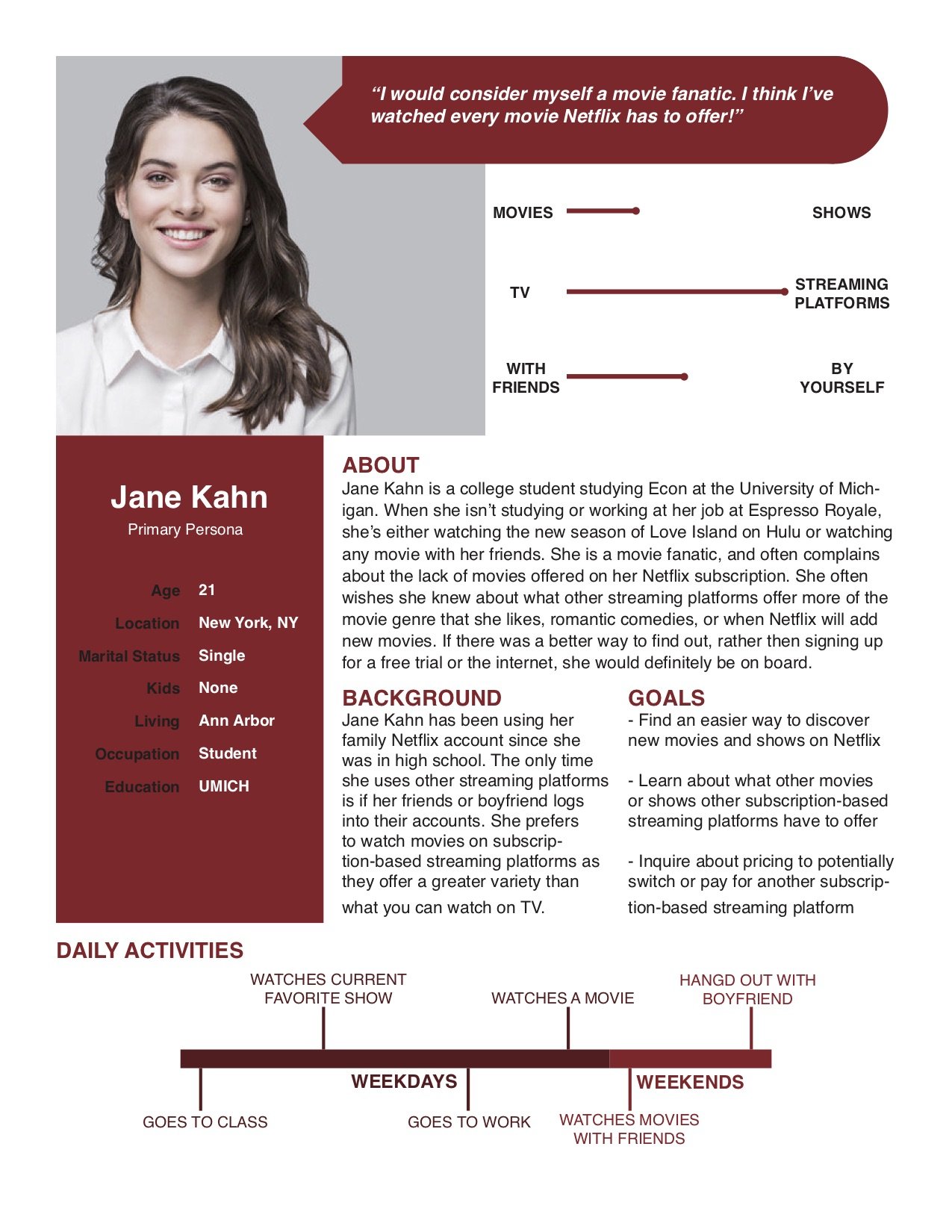
User Persona and Flow Chart
Low-Fidelity Prototype
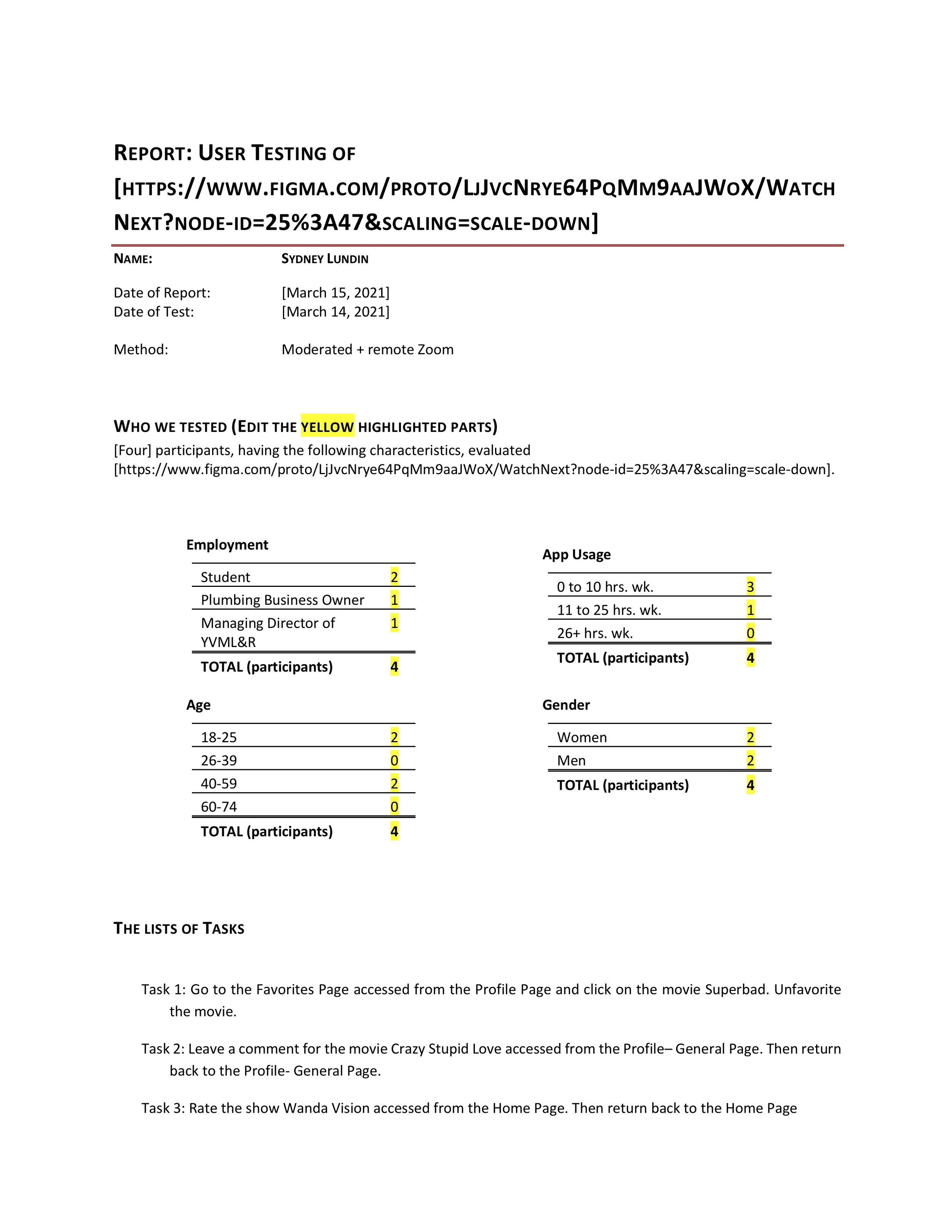
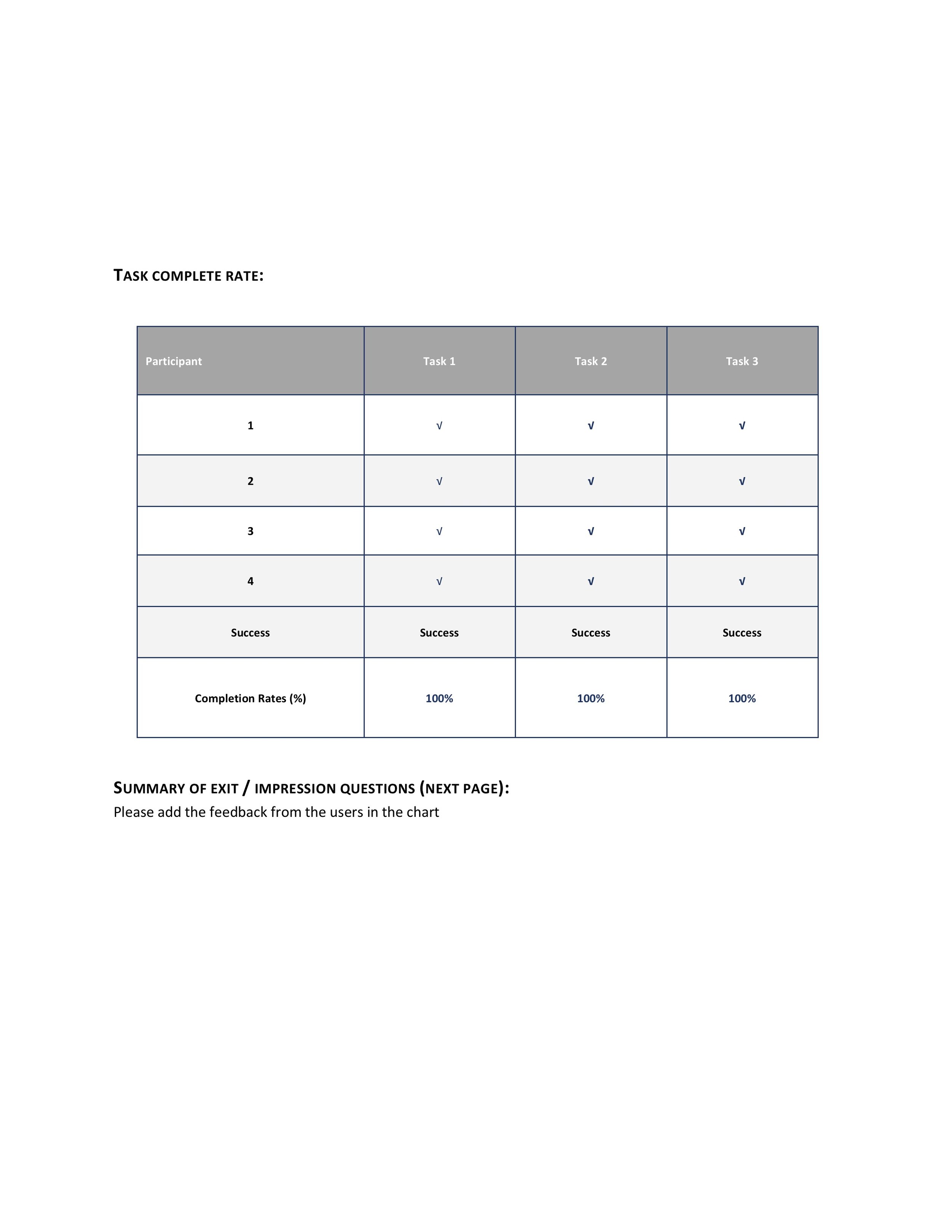
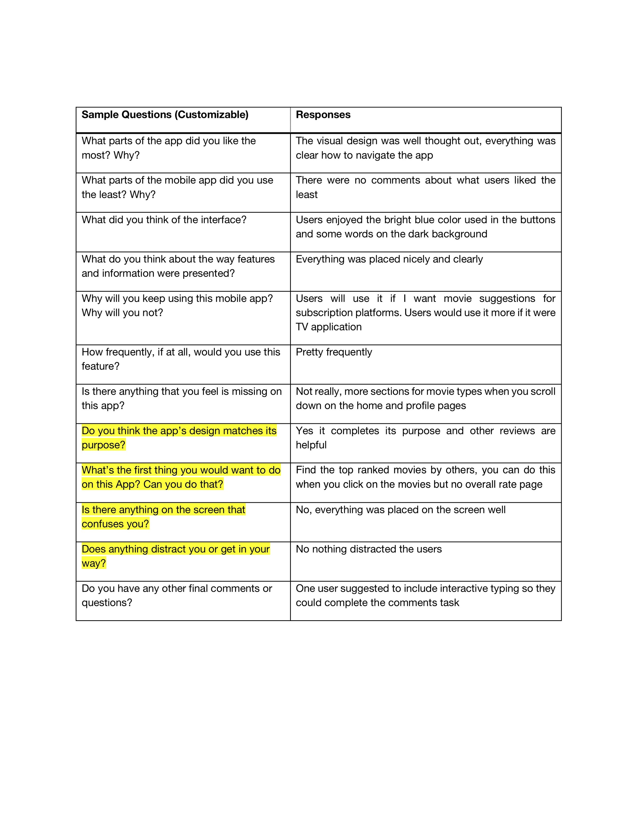
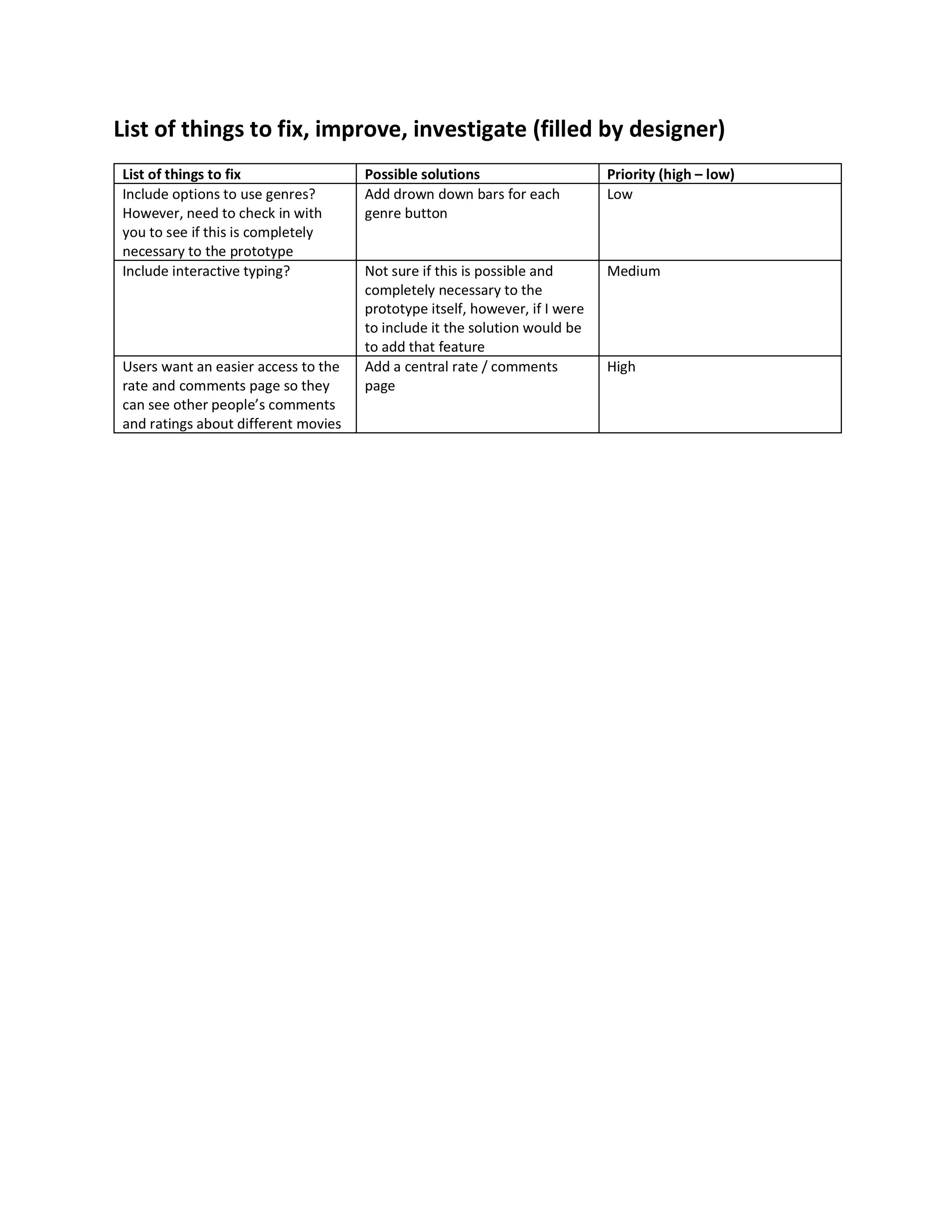
User Testing of High-Fidelity Prototype
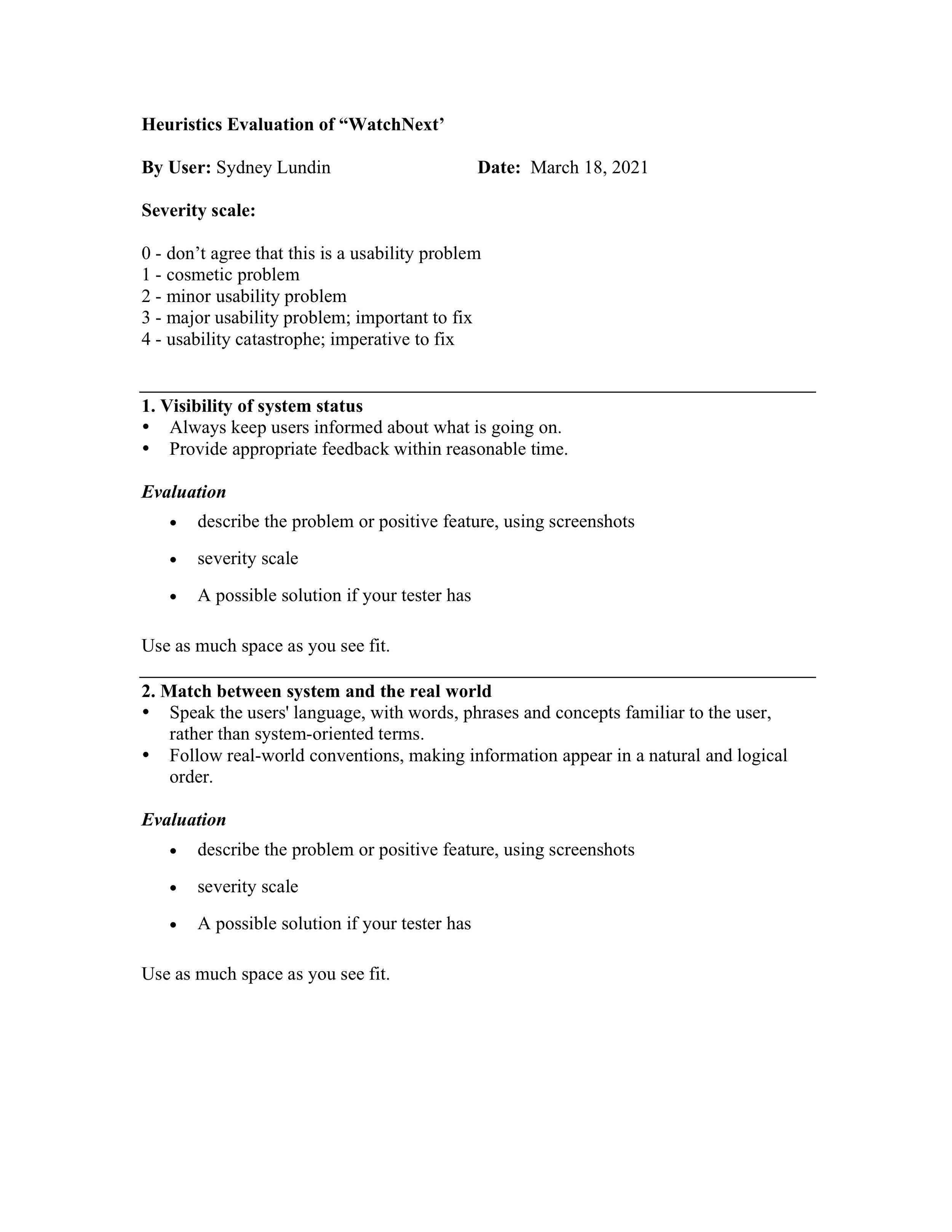
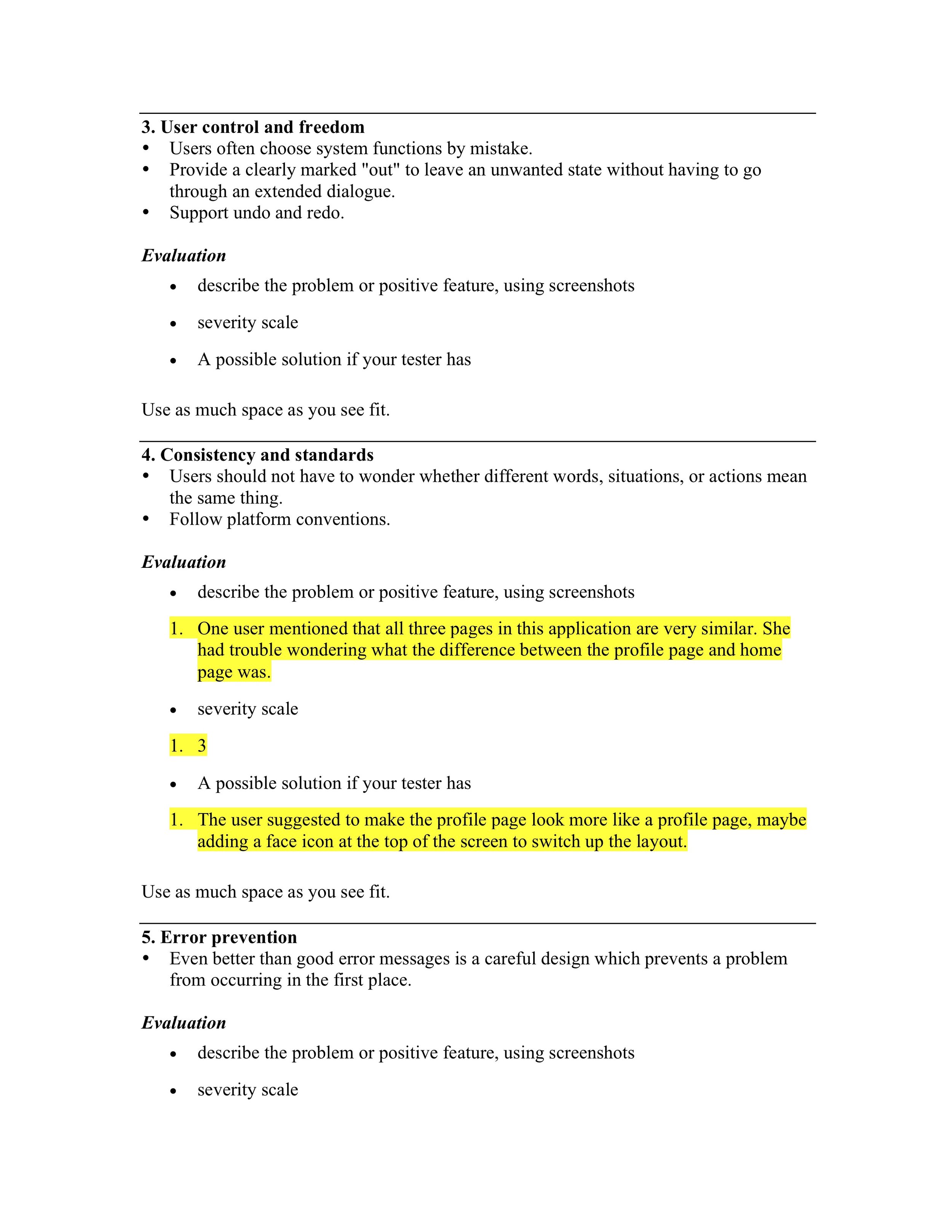
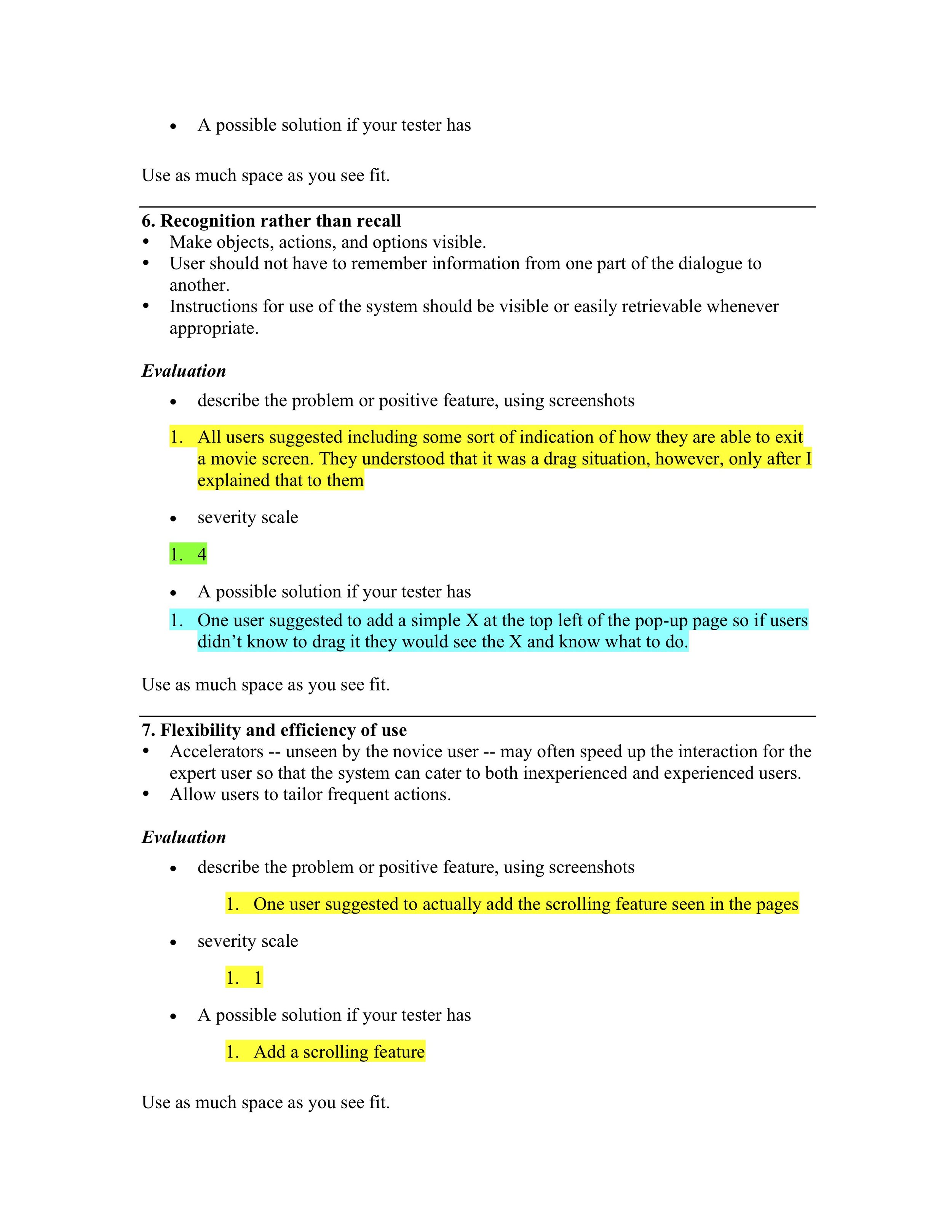
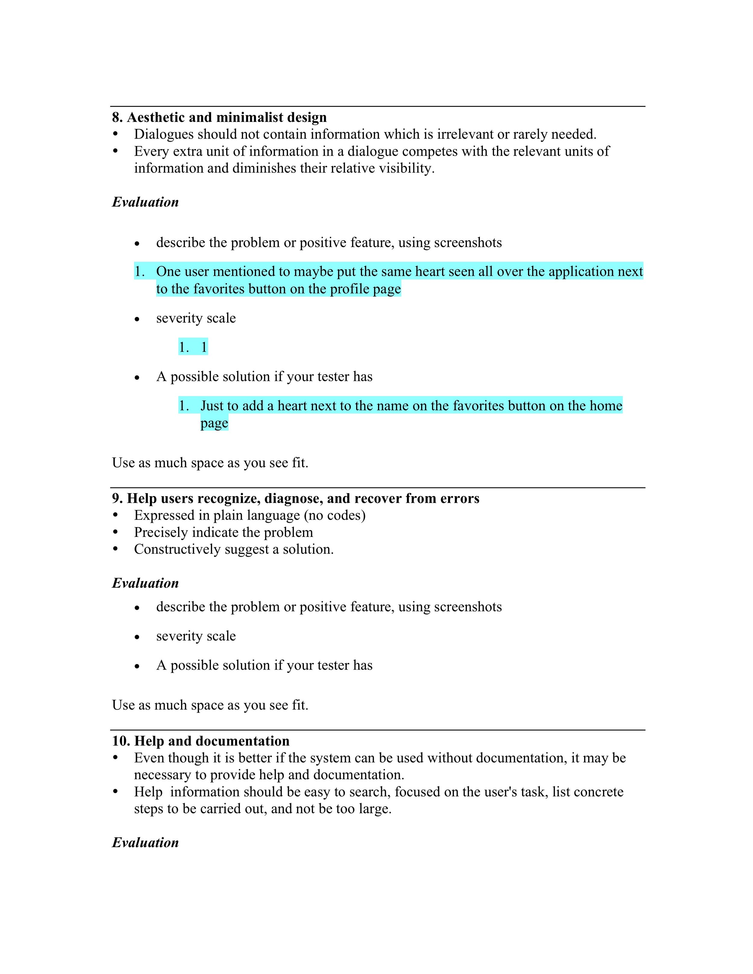
Heuristics Evaluation of High Fidelity Prototype
Problem 1: Too much consistency in all three page’s visual design.
The user mentioned that she had a hard time understanding what the difference is
between the Home Page and the Profile Page because their layouts were basically the exact same. She understood the purpose of each after I explained it, however, would like there to be some difference so it doesn’t look like she’s looking at the same page.
The severity scale of this problem is rated at 3. This is a problem that I did not see myself, however, if it will make the user’s experience more enjoyable then it is an immediate problem.
Problem 2: Unable to exit the movie pages
All three of the users who tested my application said that it was hard to figure out
how to exit the movie pages. They would click around, and it would automatically drop down, however, they did not understand that it was supposed to be a drag down page.
The severity scale of this problem is ratted at a 4. It is an easy fix, but something that absolutely needs to be fixed in order for the user to navigate the application easily. All of the users mentioned that adding either an arrow or X button on the top left corner would solve this problem easily.
Problem 3: No scrolling feature
One user mentioned to add the scrolling features where necessary so users can see
how the app would scroll and flow. This is a simple, easy fix problem but important to the prototype. The severity of this problem is a 1, as it is not entirely necessary however would look better to the users testing the prototype.
Problem 4: Addition of a heart next to the favorites button
One user mentioned that for consistency to maybe add a heart next to the word
“favorites” on the favorites button. This would show users what the heart means in all of its other location and will help them better understand the application. The severity of this problem is a 1.
Problem 5: Small font size for title and year underneath all movie titles
A user mentioned that the font size was very small for the movie title and month
released underneath all respective movie titles seen on the general and profile page. I gave this a severity score of 0. This is because she was looking at it on a computer screen
whereas on the application itself the font would appear much bigger. She also mentioned she has a hard time seeing things in the first place, and no other users mentioned this to be an issue.
Problem 6: Change “Events” to “Live Events”
One user mentioned to change the title “Events” to “Live Events.” She said Live
Events would better describe what is on that page. I gave this a severity scale of 2 because it is an easy fix but definitely necessary to what the page’s purpose is.
